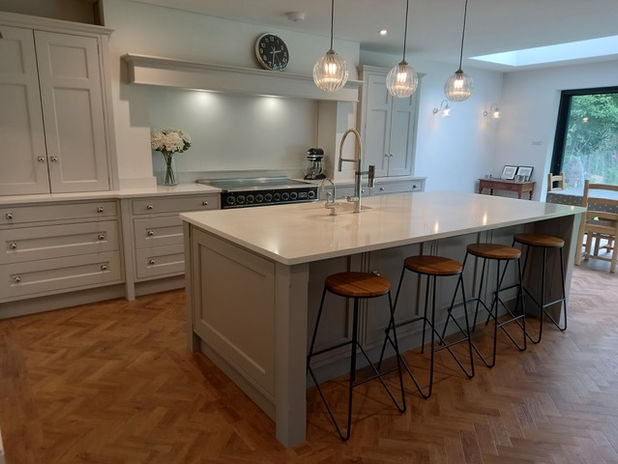
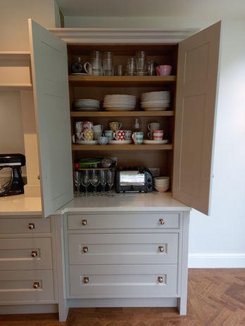
Heatherdene, West Horsley
A smooth-painted, butt-hinged simply designed kitchen in shades of grey. The extension created an alcove, perfect for a semi-walk-in larder. These cabinet doors have an extra panel on the dresser and tall units. Nickel-plated polished knobs by Armac Martin complete the sophisticated look.
Long Reach, West Horsley
We got rid of a large kitchen peninsula and orientated the family dining table the other way in this new kitchen. The brief was to include a dedicated space for their coffee machine, a double larder and plenty of drawers for all sorts of cooking equipment as the wife is a very keen cook. A tall wine cooler and somewhere to hang their beautiful wine glasses was asked for by her husband as well as no-fuss drawers which were easily wipeable. Oak veneered plywood carcases.
Hambrook Hill, Near Chichester
A bespoke kitchen designed for an extension in a Victorian country house. The client, an avid baker and cake decorator, was keen to match the kitchen cabinet handles (by Armac Martin) and the exposed butt hinges to the original door furniture in the house. Even the Quooker tap and soap dispenser were specially retro-treated to achieve the correct ’living’ patinated brass finish. Hand painted by Michael Stuart of West Horsley.
The Mount, Fetcham
Our client requested a large island and as many pan drawers as possible. The marble effect Dekton porcelain work surface adds a striking layer of texture to the muted colour scheme. Our cabinet maker manufactured the cabinetry to our specification, including the French provincial style chimney breast. Internals of drawers are all oak dovetailed.
Overbrook
Smooth finish moody and sophisticated compact kitchen in an extension.
Camilla Drive, Westhumble
A kitchen we did for clients in their new build timber-framed house, back in 2014. F&B Pavillian Grey cabinets and Silestone Luna worktops. Armac Martin polished nickel cup handles and knobs.
Surrey Hills
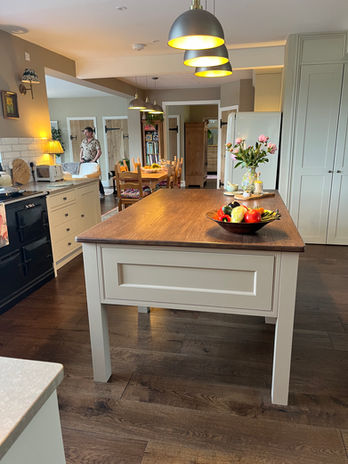
Last year our clients bought this cottage in the Surrey Hills and, typically, it was composed of a number of small rooms downstairs. They had a clear vision of how to enjoy the surrounding beautiful views and their builders transformed the interior by knocking down various walls. The resulting large and interesting space flowed from one area to another, but without clear cut zones. For this reason, our clients wanted an island that resembled a piece of furniture rather than a more substantial kitchen island used for additional storage and seating. We constructed this on site and stained the top to a darker shade of oak with OsmoOil to complement the rich new oak floor. A tea/coffee making area with prep sink positioned by the dining table is another example of the undefined zones. The clients have succeeded in creating a warm, interesting and inviting space which is adorned with artwork, table lamps, soft seating and uses a muted F&B colour scheme.


